Working It Out
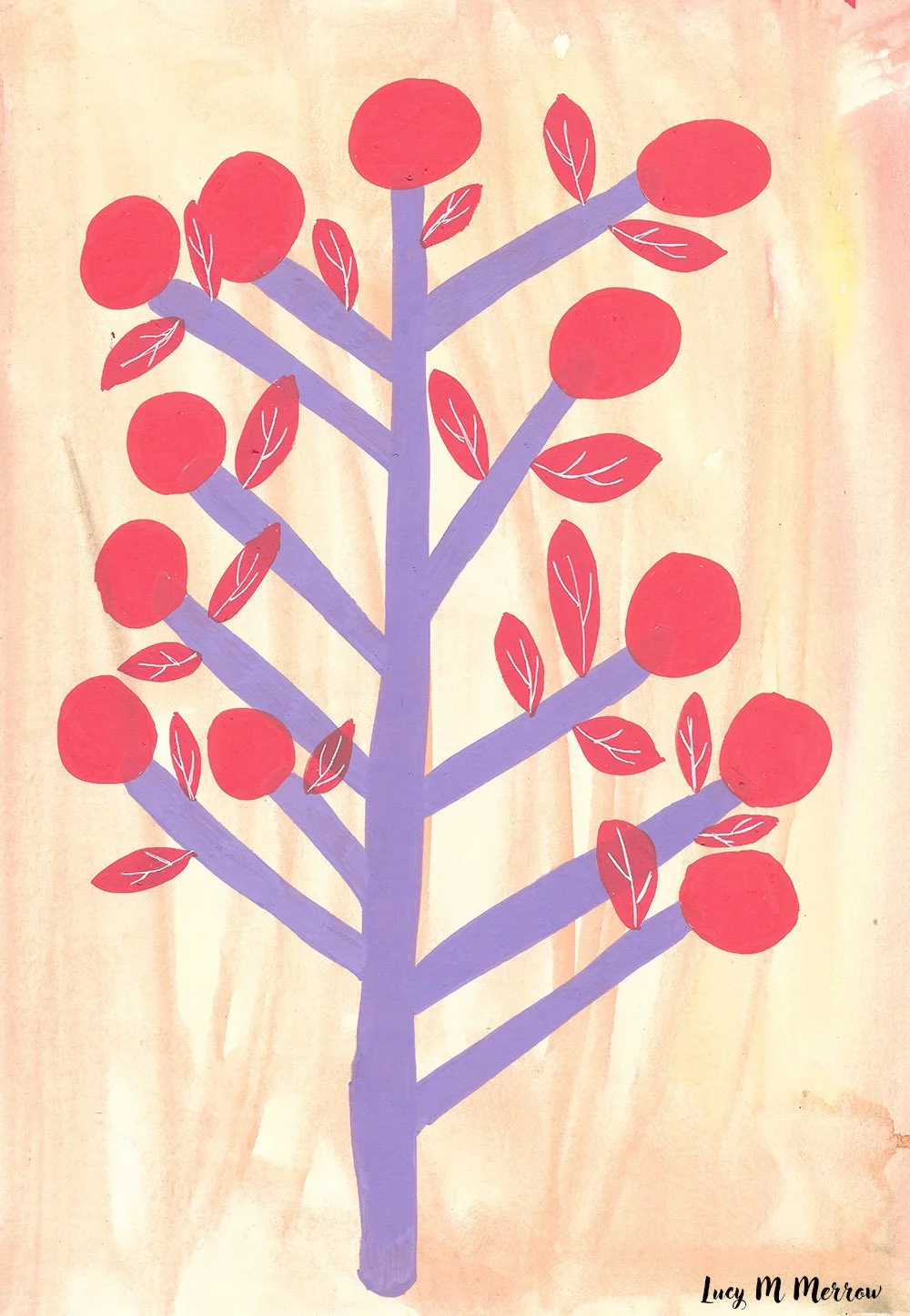
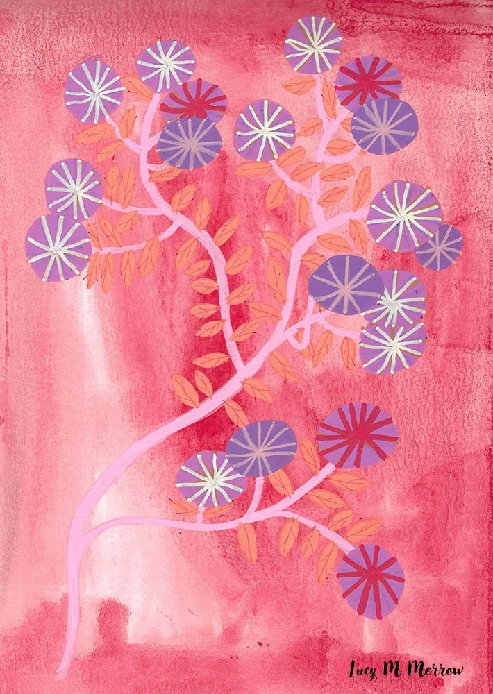
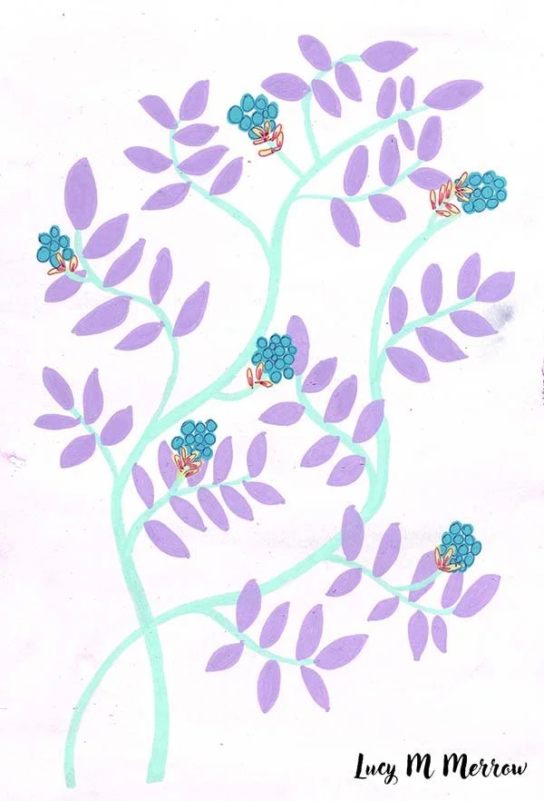
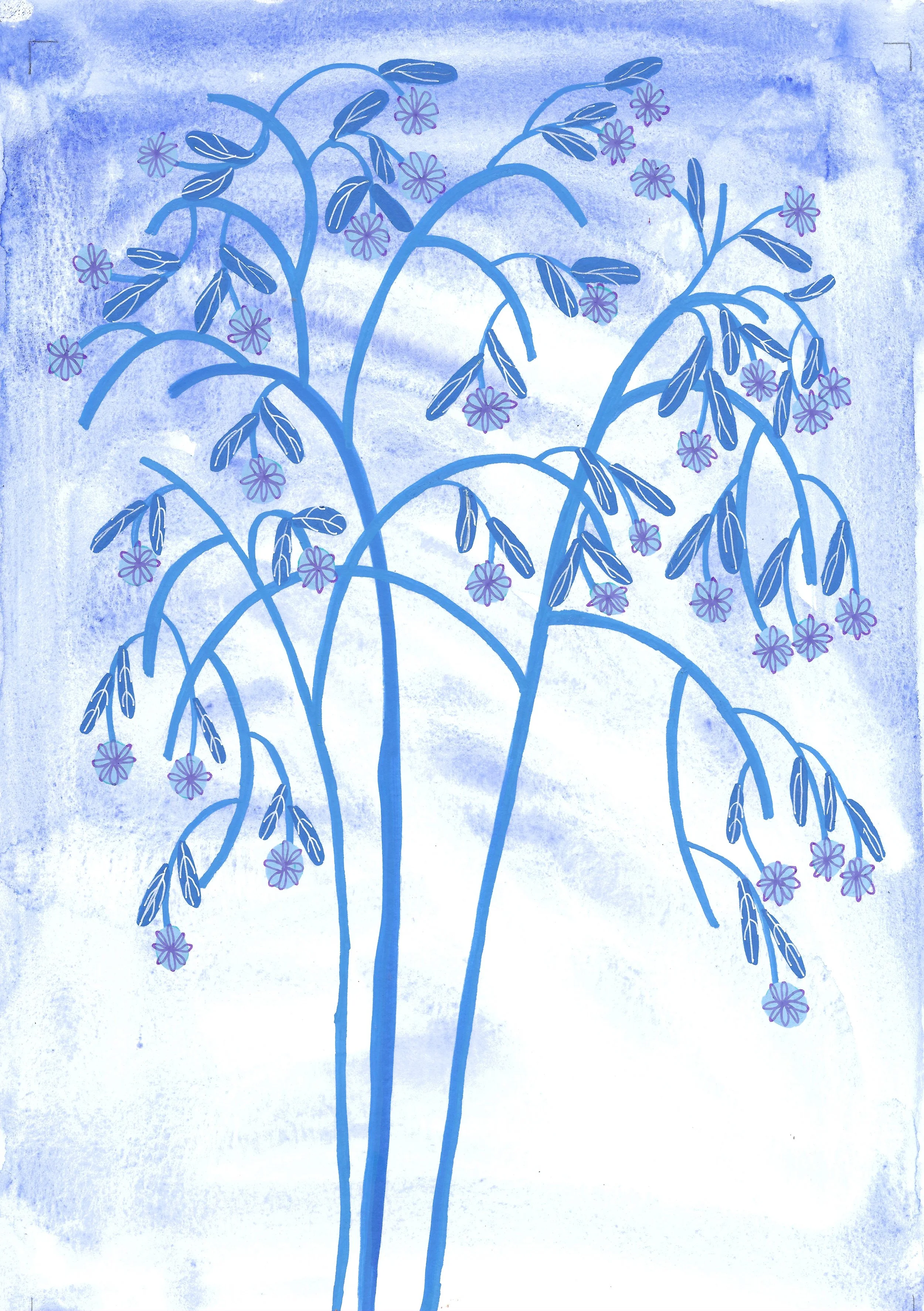
Recently, I've been exploring patterns on watercolour backgrounds. The ground isn't solid or uniform — it has watercolour bleed and imperfections running through it. I want the colours of the designs to be simple and bold, but also painterly.
Because the background is already busy, I've found I'm more pleased with simple, bold shapes sitting on top of it. But there's a balance to find between flat areas of colour and parts with sharp lines, focus, and detail. I'm a bit torn between ornate, intricate line work and solid, empty bold shapes — I think the work has to sit somewhere in between.
A real discovery along the way has been mistakes, and layers of colour. Some of the best moments have come from colour bleeding somewhere unplanned, or a layer going down slightly wrong and turning into something better than what I'd intended. I've also been making the work fit within the frame, rather than extend endlessly.
These are my recent explorations. Enjoy.